 Effects Bundles
Solid State Logic
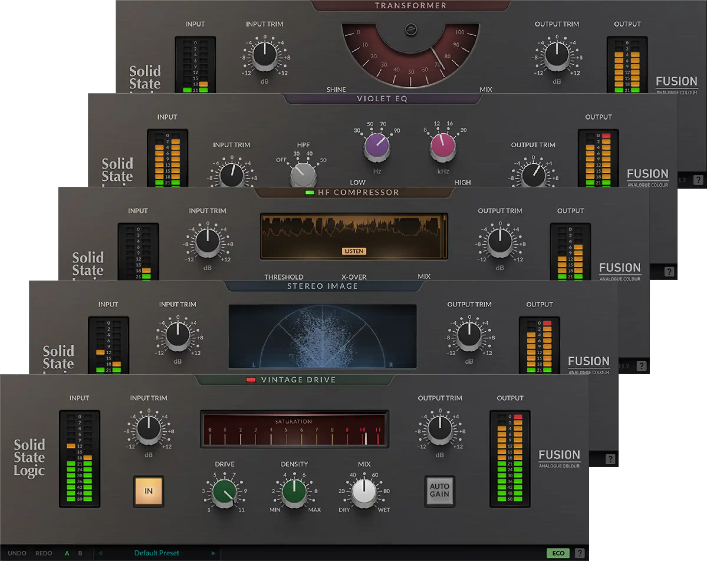
Solid State Logic SSL Fusion BundleSSL’s Fusion processors bring saturation, EQ, compression and stereo shaping into a five-plugin collection.
Check live price
On sale 14 Oct - 01 Nov, 2026
Checking current price…
The supplied wordmark is our primary signature. The face mark works at smaller sizes. Keep their proportions and give them breathing room.

Use the supplied dark logos on light surfaces. A reversed logo for dark backgrounds should be a separately approved brand asset.
Paper and charcoal carry the content. Lime highlights actions. The secondary palette gives product artwork variety without competing with the writing.
#f7f7f2#252623#62675b#d1ef75#d9d2f0#edb49c#c5d8e5#e9edddUse charcoal text on lime. Secondary text uses the darker muted token for easier reading on paper and card surfaces.
Medium weight, open layouts and carefully spaced headlines.
A clear everyday typeface for reading, navigation and controls.
clamp(3.25rem, 6.2vw, 5.375rem)Better sounds.
clamp(2rem, 3.7vw, 3rem)Fresh ideas for your next session.
1.625remA new starting point.
1.125remThe right tool helps you finish the music.
1remExplore plugins, samples and practical advice.
.875remRetailer information and supporting navigation.
.8125remPRODUCT BRIEFING / 3 MIN READ
Reading rules: 18px article text, 16px body text and controls, 14px supporting text, 13px labels. Mobile keeps these sizes. Tiny labels inside decorative illustrations are not interface text.
A shared spacing scale keeps cards, sections and controls related. Gentle corners belong to cards and panels; fully rounded shapes belong to filters and icon actions.
space-1space-2space-3space-4space-5space-6space-8space-10space-12space-16space-20.25rem.375rem.5rem999pxThese are the actual button, filter, notice and product-card styles used on the site.
Lime is reserved for actions, savings and link accents; image boxes use neutral or complementary colours. Text links have a low marker stripe beneath the text, leaving arrow icons clear. Hover, keyboard focus, active and disabled states are shared. Focus a control with Tab to see its outline.
Shared popovers support keyboard navigation, selected-state checks and search for longer lists. Native controls remain available before enhancement loads.
Try these on the deals page . The examples below show the shared appearance.
Use medium badges in discovery sections and small badges for quiet metadata above a product title. Filters and purchase buttons keep their own control sizes.
Informative, never invented. Verify a price or discount before showing it as a live offer.
Effects BundlesSSL’s Fusion processors bring saturation, EQ, compression and stereo shaping into a five-plugin collection.
On sale 14 Oct - 01 Nov, 2026
Checking current price…Fonts, colour, type sizes, spacing, corners and minimum touch targets live in src/styles/tokens.css.
Site styles live in src/styles/global.css. Product cards, artwork and article cards live in src/components/.
Products and articles are kept separate from presentation in src/data/catalogue.js. A new product should inherit existing styles.
Layouts adapt to the available width. Body text stays readable, controls wrap, and cards stack on smaller screens.